Thursday, October 29, 2015

This fall, the Institute of Contemporary Art in Boston has an exhibition on Black Mountain College. Having no prior knowledge of this institution or why it would possibly have an exhibit in a museum near me, I turned to research. According to the website, the college was created as a response to a lack of progressive universities at the time of its inception, in the 1930s. The creators of this College heavily promoted art as an integral part of a college education, which was extremely unusual compared to the other universities of its time. This college is considered to have has a "critical role in shaping many major concepts, movements, and forms in postwar art and education... influence that can still be seen and felt today". Sunday afternoon, I grabbed my CharlieCard and copy of roughly explained instructions from the Institute of Contemporary Art's website and headed over to the Kenmore Green Line T station. After about 30 minutes and several transfers (including the very strange Silver Line), I found myself in a nearly abandoned area of the city in which I now live, and walked with curiosity toward my destination, the modern-looking building on the water. After being directed to the fourth floor. I began my journey into the museum. Having no prior knowledge of what I was going to see, the initial blown up picture of the college itself seemed to indicate a series of similar photos documenting some sort of growth or life of the college and its inhabitants.


However, as I progressed through the exhibit, I became puzzled. It was a hodge podge of different art forms and pieces that were not incredibly cohesive, and the further I found myself within the exhibit the more confused I became. Was this simply an exhibit of art produced at this college? I felt somewhat cheated, as I expected to encounter some sort of revelation about the intense impression this college made on history, when all I could think was how unimpressive and familiar most of the art felt to me.
The standard, geometric abstracts,


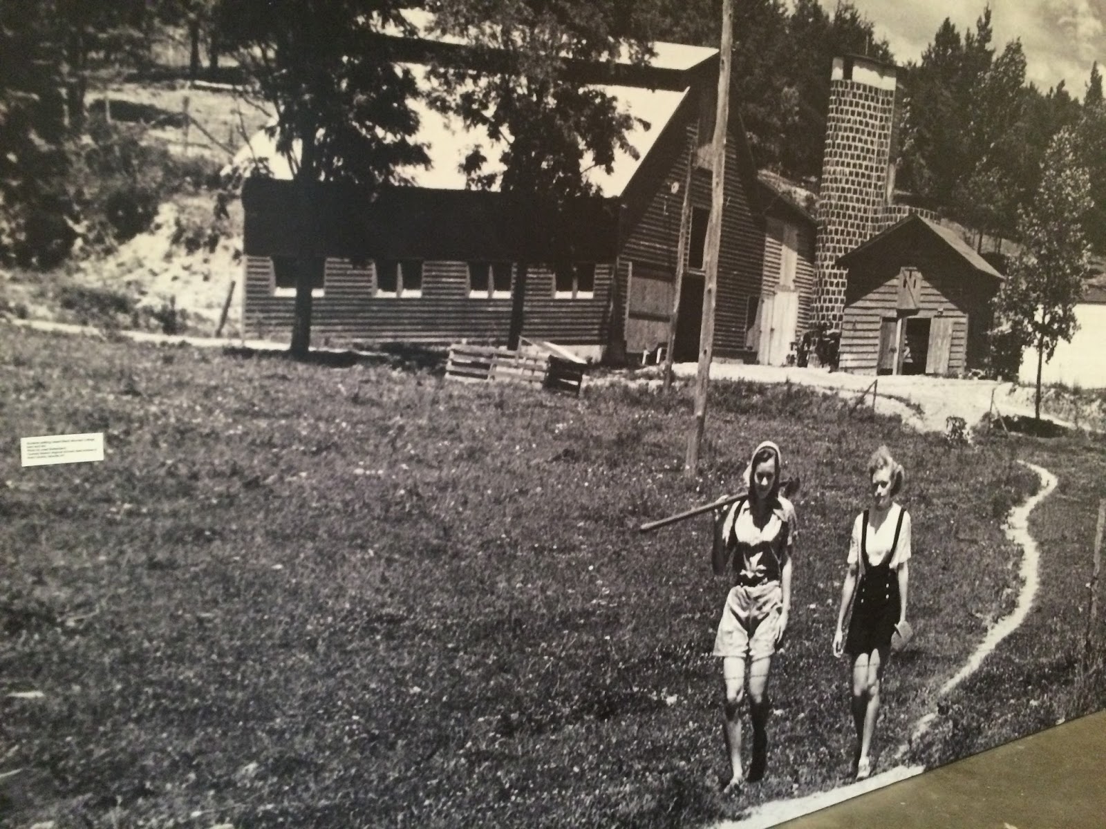
the interesting but not overwhelming photographs,


the vaguely more-artistic-than-a-tablecloth textiles,


the somewhat creative use of materials,


it all felt too familiar and not very overwhelming or moving. I wove through halls of similar pieces, and as I snapped away I felt frustrated that I had taken such a trip to such a large museum only to be shown a multitude of similar and confusing art pieces. Trying to salvage the trip, I took a step back and tried to look at the exhibit for what it was: simply a collection of art related to a relatively unknown college. I observed the colorful geometry, read about the three dimensional objects and even stayed to watch the strangest, most stereotypically artsy performance of a nearly soundless tuba. Once you realize that it wasn't intended to be the most splendid, magical exhibit, you start to just appreciate the small details of these art pieces that came from a short-lived, controversial college, and find interest in how something that may have been forgotten by most for years is allowed to be rediscovered through this small museum. One of my favorite pieces were Inspiration and Knowledge by Jean Charlot.


I felt that it really was a work of art. Some of the pieces were less impressive to me (considering my own lack of artistic talent I understand the irony) but I really appreciated the talent and effort that went into the piece which was not only aesthetically pleasing but also meaningful. I also felt incredibly drawn to the modernist pieces, as I feel they were very nice to look at while simultaneously being ambiguous enough to allow for individual interpretation.


As for the statement that the college shaped movements, I am not sure, as when pieces struck me as similar to famous artists, including Jackson Pollock


and Pablo Picasso,

I found that the famous artists came first, and couldn't truly have been influenced by the work of the college. Although its Wikipedia page lists plenty of "notable alumni" , I cant say I really knew any of the names. Granted, I'm not well educated in famous artists, but for an exhibit put out to the public claiming such notable alumni I found it odd that not one of them was a very common name that many visitors would know.
As I previously mentioned, I did witness an interactive art show with a tuba. At first, all I really saw was that there was going to be a tuba performance at 3 and it was 2:50 so I figured I would stick around. The two most stereotypically artsy looking men came into the room a few minutes after three (fashionably late I suppose) and one set up a chair and brought out a tuba while the other spent several minutes trying to decide where to relocate the sign to. When the tuba player finally sat down and a sufficient crowd had gathered, everyone held their breath, the musician took a deep breath and....


...played nothing. I'm not joking. For several minutes, I stood there puzzled, hoping everyone else was as puzzled as me, and that it wasn't due to my lack of artistic mindset. Occasionally, the player would emit a sort of breathy, scratchy note or two at a very low volume, but other than that he was basically pretending to play. That's when I turned back to the sign and actually read through it.
I have to be honest, even after reading that I'm not sure I really understand the impact of the performance or the message, but it was certainly interesting.

The last two thoughts I have are as follows:
1.This exhibit mentioned a man named Buckminster Fuller who constructed a giant geometric dome. While at the time I found this less than interesting, while later doing my chemistry homework I found that a molecule resembling this structure had been named after him, and that was rather interesting.


2. It is always worth it to continue to wander through the rest of a museum you are already in, because you will often find hilarious or fascinating art works you didn't even intend to find.


Wednesday, October 21, 2015

As for the project, I had the initial idea of a project based in "diversity". Even though there are a significant amount of of projects and artworks with this same message in mind around campus, including the current Warren Towers installation. The first thought was something of a stacked face, slicing horizontally to cut out rectangles of eyes, noses, mouths, hair, etc. However, this looks incredibly strange in practice, and conveys less of a diversity meaning and is more just entertaining.
I then experimented with slicing diagonally, and I feel that is is less laughable and more meaningful as a depiction of 

I feel like even these rudimentary images show that it is more impressive to slice the faces this way. It also allows certain facial features to match up really well and show fluidity between races and facial types and genders while also showing major differences in structure and features. The next step is to put these on a wall or structure somewhere. Since it originally had a piece on diversity, the Warren Towers windows seem like an ideal spot for this hypothetical piece. I experimented with the diagonally sliced faces and windows, assuming this piece would be constructed out of a similar translucent material that the existed piece consists of.
This piece wouldn't necessarily look exactly like this, as it is a rudimentary depiction. However, I like the simplicity of the four main panels, and the idea of adding quotes on the street level. I feel that quotes not only strengthen the idea that words can be as effective as pictures, but it also helps the piece feel multi-faceted and not just one finite medium. 

Next, I experimented with the panels. At first, I had assumed the panels were larger and wider, which may have lent it better to these facial splices, but upon really looking at the layout, I feel the tall, narrow panels might lend themselves better to a splice based upon panel location, to compose one or two larger faces sliced in accordance with panel pattern.


I made three drafts, to show one more full set of panels, one more sparse, and one to try to combine both ideas. I love how this works without being overwhelming, and it gives a true sense of the message, which truly is diversity. Upon coming to BU, I experienced more diversity than I ever had back in the suburbs of New Hampshire. However, upon trying to google pictures for the faces, I found myself having to specify certain races to achieve a diverse compilation, which seems less progressive than it should be for 2015. So obviously for the project I would be gathering pictures of my peers at BU to create a more naturally diverse mismatched face. I also feel the quotes work quite well in this project as well. 
At this point, I began to see how these panels resembled bricks, and was feeling I should branch away from the Warren Towers idea for a moment. I was thinking about all of the empty walls and brick sections on the BU campus. While another project could just be taking these same ideas and transferring them to a blank wall, like lining up facial splices or making posters that resemble the second idea, I focused on the eyes. For something simple, I just cropped out several pictures of eyes and put them on top of bricks. This could be a really simple project that doesn't necessarily stand out too harshly or scream "art project" while still sending a message and making someone who notices it think.
I think it would be an easy way to decorate an otherwise boring wall in an interesting and creative way. It could also have a quote included on a brick or two or weaved in between the eyes. I then returned to the Warren Towers idea and threw together the most simple idea of them all, of showcasing smiles. Although my least favorite at the moment, I do appreciate the simplicity and I feel like this could actually work because it is so simple. It shows the diversity of BU while being just a simple and uplifting idea of sharing a smile.

This could be interspersed with smaller smiles, or a quote about them, but I just put this together as a rudimentary idea that I can build on if I feel I want to pursue this. In total, while I feel like the Warren Towers ideas are the most feasible since there is a need and it replaces the old one without changing the message, I also really like the idea of putting something simple on bricks since I like more of a subtle approach on city art sometimes and the Warren Towers display is anything but subtle.